How To Optimize Mobile-Only Websites
A few years ago, mobile devices were just used for phone calls. But nowadays, the traffic that our websites receive from smartphones just keeps increasing to a level that their importance cannot be denied anymore. And with new technologies and opportunities come new challenges and questions.
To make things easier, we are sharing here a list of questions and answers about how to optimize mobile-only versions of your websites, taking into account technical, user experience and SEO considerations.
- Why would redirecting to a mobile version make sense?
- Should you display different content for mobile browsers in the same URL, or redirect them to a different, mobile-only URL?
- Should you create different versions for feature phones and smartphones?
- How is a mobile URL marked as a mobile, alternative version?
- If there is no corresponding original page, where should a canonical tag inside the mobile version point to?
- How can you detect mobile browsers to serve them different contents?
- Should Google's mobile crawler be considered in mobile browser redirection scripts?
- Server-side redirection or Javascript redirection?
- Permanent 301 redirect or temporary 302 redirect?
- Should you include a vary HTTP header in mobile URLs?
- Should you include a link to the original, regular version in your mobile-optimized version?
- Where should a link from the mobile version to the regular version exactly point?
- How to allow mobile users browse your regular version?
- What about redirecting desktop / regular users accessing your mobile version to your regular version?
- Are tablet browsers mobile browsers too?
Why would redirecting to a mobile version make sense?
Responsive web design presents several advantages when compared to creating a detached, alternative version just for your mobile users:
- Maintenance can be simplified. Even when responsive websites can increase the level of complexity, only one website would have to be modified. Content-wise, all your contents would remain on just one place, making it easier to expand and update your site for both, regular users and mobile users.
- SEO can be simplified. Presenting a single version of your website for all your users with (mostly) the same content avoids the hassle of notifying search engines about both versions, making clear which one is the main version and which one is the mobile-optimized version.

However, even when responsive web design is probably the only trend that will survive in the not-so-distant future, creating a responsive web design instead of a mobile version may not be the best option under certain circumstances:
- Budget constraints. Responsive designs require additional planning in advance and testing in a broad array of devices and screen resolutions, for all the kinds of content.
- Outdated phones. If most of your users still rely on feature phones or old smartphones, but still do want to navigate a mobile version of your site, then you better make that version very lightweight and fast, specifically designed with simplicity and speed in mind.
- Legacy code. If you already do have a mobile version in your website, or a website that would be very hard to turn into a responsive website, then working with your existing versions would make sense.
- Context restrictions. The goals of your users while on the go may differ from the goals of other users accessing your website from a desktop computer. There are some additional interface and context restrictions as well: typing on a small touchscreen while walking down the street may render your web forms useless; reading on a tiny mobile screen may render your detailed, long pages overwhelming.
If you are under one of these previous scenarios, you will definitely want to keep using your separate mobile website version, and optimize it as much as possible so:
- You will be serving easy-to-navigate content to your users.
- It will be easy to discover for search engines.
- Your mobile version won't compete with your original version, cannibalizing your search engine results.
Here is a list of frequently asked questions about how to optimize the performance of a standalone mobile version.
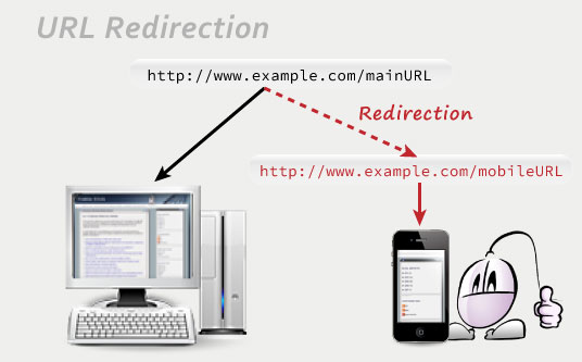
Should you display different content for mobile browsers in the same URL, or redirect them to a different, mobile-only URL?
There are two approaches to serve mobile optimized content to your site users: keeping them in the original URL but sending them different, mobile optimized content, or redirecting them to a different URL where they would find mobile optimized contents.
The first approach has a SEO-related advantage: all links pointing to one of your mobile URLs will also pass their ranking to the main URLs, since both are the same.
However, this approach also has bigger risks as well. Issues with this configuration, like failing to tell apart your mobile users appropriately, may lead to search engines think that you are sending shallow content to all users, or creating a URL masking scheme.
There could be issues with your mobile users as well. Without the URL providing additional feedback about the version they are browsing, your users might be confused about thinking this is the only version of your website (if your "go to original version" link weren't very visible.)
That's why redirecting to a mobile-only URL still makes sense, as it can be technically easier to work with, pretty clear to understand, and very well organized. But you need to make sure such an URL is marked as just for mobile browsers, as an alternative version, so it won't compete with your regular URLs in search engine rankings.
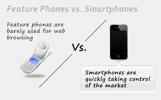
Should you create different versions for feature phones and smartphones?
While smartphones boast not-so-tiny touchscreens and powerful processors, those old mobile phones out there, the so called feature phones, will lack enough screen real estate or processing power to deliver a good browsing experience in most websites.
The answer to this question depends on your business. Your browsing stats will be priceless for this purpose. Most stats tracking software will give you a detailed breakdown about the hardware that your visitors are using to navigate your site. If that list contains a decent percentage of old mobile phone users, then creating a version optimized for featured phones would make sense.
However, mobile phones are quickly evolving. It depends on your target market and on the country where your business is located, but chances are that feature phones will quickly disappear in favor of more powerful smartphones. And taking into account that the processing power of smartphones is coming closer to being little desktop computers, chances are that your future website design plans should consider only smartphone-optimized versions.
At the end, this is what the other big web design trend of responsive design is already hinting: in a not-so-distant future, desktop versions and mobile phone versions would only be distinguished by the layout used to present information. In the meantime, a single alternative fast-loading and concise mobile version should suit the needs of all your mobile users.
How is a mobile URL marked as a mobile, alternative version?
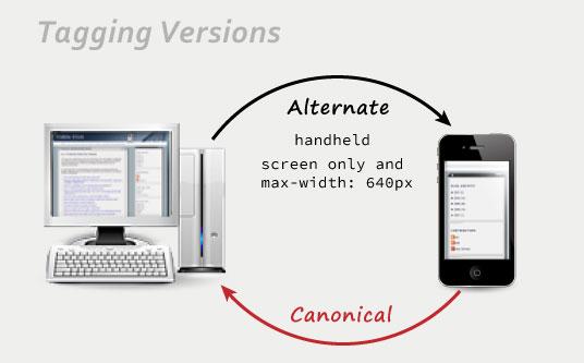
Google recommends tagging pages with alternative versions following this approach:
- The regular, original page should signal that there is a mobile-friendly version serving similar content.
- The mobile-optimized versions should point at their related regular pages, marking them as the main, canonical pages.
Screen size is used to discriminate mobile phones, while the media type handheld is used to target feature phones. In the most common scenario where there's just a mobile-friendly version, these are the alternate link tags that you would include in your main, regular version:
<link rel="alternate" media="handheld" href="http://www.mobileURLHere" />
And this is the canonical link that you would include in the mobile version:
You can also tag mobile versions in your sitemap.xml as alternative versions. Each alternative mobile version should be associated to its related regular version, so the sitemap of your website would look like this:
<urlset xmlns="http://www.sitemaps.org/schemas/sitemap/0.9"
xmlns:xhtml="http://www.w3.org/1999/xhtml">
<url>
<loc>http://www.mainURLHere</loc>
<xhtml:link
rel="alternate"
media="only screen and (max-width: 640px)"
href="http://www.mobileURLHere" />
</url>
</urlset>
It is important to make sure you are redirecting exactly to the URL specified in these alternate tags, or you could be sending confusing information to the search engines, and you could even risk getting your website flagged as spam.
If there is no corresponding original page, where should a canonical tag inside the mobile version point to?
If your mobile site doesn't mirror your original site in full (that is, having a mobile-optimized page per each original page) then the quickest approach would also be the safest: small mobile websites can redirect all their pages to your main url in your original version, ensuring all of them pass pagerank to your main webpage.
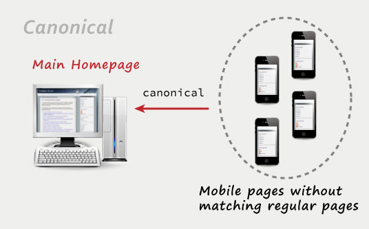
Take into account that, in an ideal case scenario, every single page of your main website should be having a mobile-optimized page. Other scenarios can lead to bookmarks that don't work as expected across different devices, or, as Google calls them, irrelevant redirects – unless your mobile version is specifically crafted to serve an optimum version considering your mobile users' context and market niche.
Update: in this official blog post titled Changes in rankings of smartphone search results Google updated what they consider an irrelevant redirection. According to this report, mobile-accessed pages without a mobile version available shouldn't redirect to your main mobile page, as that would be considered an irrelevant redirection. The recommended approach for pages without mobile versions is to lead the user to the original, non-mobile-optimized page.
Other than that, the recommended suboptimal approach according to Google is having a mobile-optimized page for every single of your regular pages (thus removing the risk of irrelevant redirections.) And the optimum recommended scenario would follow a fully responsive website approach, with a single version that would work nicely on all devices.
How can you detect mobile browsers to serve them different contents?
Mobile browsers identify themselves through their own user agents. By identifying their user agent you can send them different contents or redirect them to a new page.
You don't need to create a whole list of user agents by yourself. There are some scripts out there that would take care of that for you. Detectmobilebrowsers.com is an open-source mobile browser detection library that will do the trick, offering scripts in several different programming languages (Apache server scripts, Javascript, ASP, PHP, etc.)
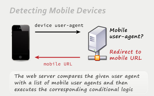
Be careful with this tactic, though, since new mobile devices, not considered in this list, might eventually appear. There's a slim chance of your mobile detection script running outdated and classifying new devices into the wrong category. So make sure you keep updated detection rules as well.
Should Google's mobile crawler be considered in mobile browser redirection scripts?
Google has a Googlebot-mobile webcrawler, specifically dedicated to crawling mobile versions, which is completely independent from their regular Googlebot. So it would make sense that this crawler reached the mobile version of your website.
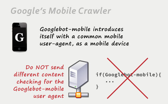
However, Googlebot-mobile presents itself using the user agent of regular, well-known smartphones. You don't need to discriminate Googlebot-mobile in your browser-detection scripts. Google warns that doing so can be flagged as URL cloaking, which would bring you a penalty from Google.
Server-side redirection or Javascript redirection?
There are a couple of different approaches when redirecting your mobile users to a different mobile version. You can perform the appropriate user agent checks on your visitor's web browser by using a Javascript redirection. Or you can go ahead with a server-side redirection, so your web server performs the browser agent checks (either directly on the server engine by using .htaccess rules, or in a server-side programming language, such as .NET, PHP, Ruby and so on.)
The problem with a Javascript redirection is that part of your original page needs to load before your mobile user is redirected to the appropriate version. On the other hand, a server-side redirection would leave the user agent checks and processing to the server itself, preventing your user from loading unnecessary content.
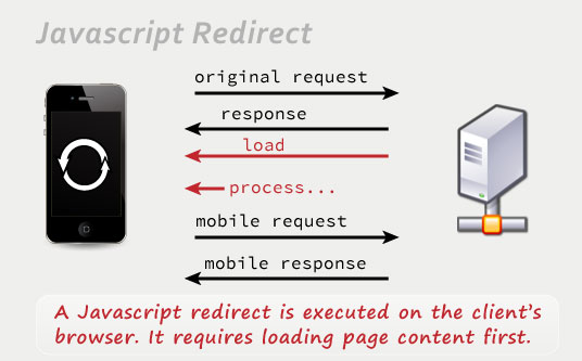
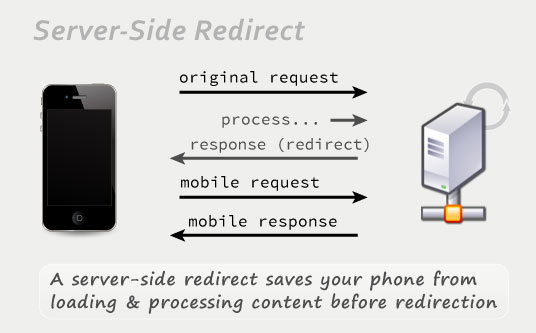
Taking into account that mobile users have limited bandwidth and processing power, server-side redirects are the preferred approach since they will be faster.
Permanent 301 redirect or temporary 302 redirect?
There are two main different types of server-side redirects that are triggered by specific HTTP response headers directly sent from the server:
- A 301 redirection is a permanent redirection, indicating that the original URL doesn't matter anymore, so all queries should be redirected to the new URL.
- A 302 redirection is a temporary redirection, just signalling that visits to the original URL are redirected to a new URL at the present time, but that this is a temporary situation expected to be reverted.
If you use response codes to redirect your mobile users to the appropriate, mobile version, in Google's own words:
For this purpose, it does not matter if the server redirects with an HTTP 301 or a 302 status code.
So it really doesn't matter what kind of redirection you are using to send your users to your mobile version.
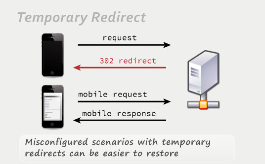
However, let's consider a worst case scenario: if some misconfiguration or glitch in the process is preventing both versions of your site from being understood the right way from a search engine's perspective, using a permanent 301 redirect from your regular version to your mobile version would send most or all your pagerank, traffic or users to your alternative, simpler, mobile-optimized version. Such a scenario would be a disaster for your SEO strategy.
That's why using a 302 temporary redirect pointing towards your mobile version is a better strategy in terms of risk prevention.
Should you include a vary HTTP header in mobile URLs?
Google mentions in its guidelines that, in case you use any kind of redirect, any redirecting webpage should also be outputting a Vary HTTP header to notify potential search engine crawlers that mobile crawling is also in order, since the page can lead to different results depending on the user agent used to browse it. This way, every mobile page would be crawled, and the structure of your site would be better understood.
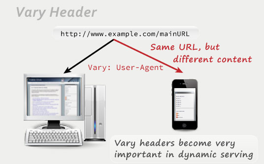
This also holds true for websites using the same URL to serve optimized content for both, mobile users and regular users (dynamic serving.) In this case it can become even more important, as there wouldn't be any other way to tell the search engine spiders that a mobile version exists for the present page. You would also make sure that the mobile optimized version wouldn't be considered as masked content or as the main version related to this URL, since you would be announcing its existence through this header.
The Vary header should be sent indicating that the contents in that page can vary depending on the user-agent, so it should look this way:
Should you include a link to the original, regular version in your mobile-optimized version?
Definitely. Some users will still want to access the full contents of their main version if they feel that they are missing part of the content, or if they just have a smartphone powerful enough for regular browsing.
If your mobile-optimized version is simple and short enough (as it should be,) the link to the original article / normal version could be safely included at the bottom of the page: there wouldn't be any need to go to the regular version if the mobile version provided enough information by itself. Going to a normal version is rarely a decision taken in the first second.
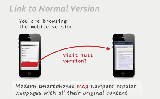
Make sure to display this link to your main version in a very visible way, though. You really do want to make your users know there's still a different, potentially more complete and eye-catching version that they could visit if they wanted to. This becomes specially important if you are serving your mobile contents from the same URL, as the URL wouldn't offer any additional clue about the existence of a regular version.
Where should a link from the mobile version to the regular version exactly point?
In the ideal case of having a mobile website composed of a mobile page per each regular page, the links pointing to the regular versions from the mobile pages should precisely target their corresponding regular page, talking about the same subject and offering similar content.
However, things can be a little bit more complicated if your mobile website comprises just a subset of your whole regular site, which can still make sense to offer a simplified, more straightforward version of your contents to the specific market niche composed of your mobile visitors.
If there were no matching page, offering a link to the homepage of your website from its mobile version could seem like a good idea, since the homepage presents the most easy-to-access gateways to all your content.
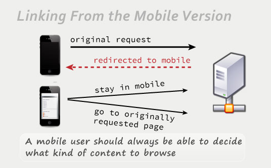
But that's not enough. Consider the following scenario: a user performs a specific search from his web phone, clicks a specific search result, and is then redirected to the homepage of your mobile version instead. This can be okay as long as your user appreciates the ease of navigation of your mobile version, and as long as he finds relevant information. But, what if he just wants the answer to his original, specific query, and thinks that his smartphone should be able to handle browsing the full, regular webpage? Giving him a link to your main homepage will feel like a burden.
That is why you should also offer a link to the page your mobile users were trying to reach before being redirected to the mobile version of your website. You can annotate the page where a redirection was started (for example, in a parameter, cookie or session variable.) Mobile users pleased by the ease of use of your mobile version would remain there with no problem. And mobile users wanting to reach the original contents that triggered their click in the search engine results would still have the option to view the original contents they were originally thinking about.
How to allow mobile users browse your regular version?
Mobile users should be redirected towards your mobile-optimized version. So when one of your mobile users prefers trying to navigate your full website using a powerful smartphone, and clicks a link to your regular version, how to prevent him being redirected back to the mobile version, and stuck in an endless loop?
One of the most straightforward approaches to solve this issue is to add an additional parameter to override this redirection for users who explicitly request to see full versions from their mobile phones. Just a query parameter appended to the target URL can be enough. The target, regular webpage would check for the existence of this parameter. If found, any redirection would be skipped this time, allowing your mobile user to navigate the regular version of your website.
Nevertheless, that might not be just enough. That same user could still want to keep navigating other regular sections of your website. If such parameter weren't kept, your user could be redirected back to a mobile version when clicking a new link.
So once a regular version is requested by including a parameter to override mobile browsing, this preference should be stored in a cookie for your user, or even just in a session variable. So your user won't have to worry about being redirected to your mobile version again.
If a cookie or session variable were set for that user, no regular page would redirect such specific mobile user.
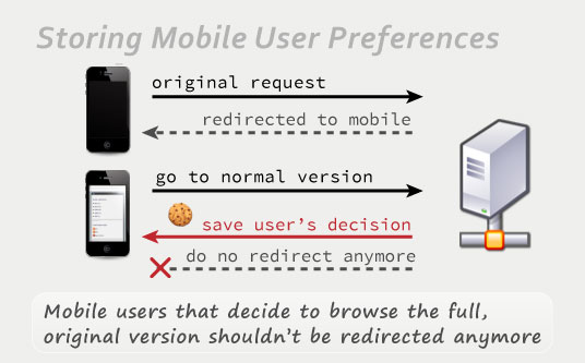
On the other hand, this user can still go back anytime to your mobile version, not by an automated redirect, but by pressing his “back” button on the web browser of his mobile phone. This is a rare scenario that might only happen if your user decides that the regular version is too much for his phone after explicitly requesting it, but being covered about this case is still worth for optimum user experience purposes.
What about redirecting desktop / regular users accessing your mobile version to your regular version?
This is what Google calls bidirectional redirects. It prevents your desktop users from landing on a mobile-optimized version, which in their large screens would look rather limited or empty, and thus, wouldn't create the appropriate first impression.
If you have an updated mobile agent detection, then bidirectional redirects can make sense. It is very strange that a desktop user would rather see the incomplete or limited mobile version instead of the full, original version of your website.
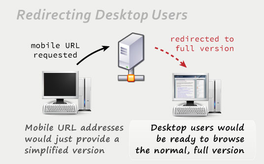
Independently from that redirection for desktop users, some mobile phone users would still like to access your regular pages. Having a link offering to visit the normal version instead would come here into play.
The only catch about bidirectional redirects is that you need to make sure your code is working perfectly. If not, you could leave your users stuck in the wrong site version or in a redirection loop.
Are tablet browsers mobile browsers too?
Tablets have some points in common with mobile browsers: they provide their users with some mobility, not-so-big touchscreens, and less processing power than desktop computers.
However, most modern tablets already allow regular navigation in regular webpages with ease. Their processing power is enough to move normal webpages, and their screens (even the 7-inch ones) are big enough to provide good website readability.
That's why I suggest not treating tablets as mobile devices, and to exclude them from your user-agent detection scripts.

Besides, it is still possible to redirect tablet users to your mobile version as well. This can make sense if your regular version is not so tablet-friendly (if it takes too long to load, if it features Flash content that won't work in iPads, or if it just targets a niche where you wouldn't include your tablet users.)
If you are using the user-agent-detection script previously mentioned, detectmobilebrowsers.com, you would just need to add the following code to the first regular expression to treat iPads, Kindle Fire, Playbooks and Android tablets as mobile devices as well:
 Stumble